Friday, 24 April 2015
Monday, 20 April 2015
Evaluation - How did you use media technologies in the research and planning, construction, and evaluation stages?
How did you use media technologies in the research and planning, construction, and evaluation stages?
I have presented my research and planning as well as my evaluation in blog form on the blogging platform, Blogger. Using my Google account, I was able to make a blog. I have used Google Chrome primarily for researching as well as Google Images for finding posters and magazine covers. I have also used YouTube for not only researching teaser and theatrical trailers but for Photoshop tutorials and how to's. I have also used Google Drive and Google Docs for writing up my shot list, prop and actor list and scripts. I have also used the highly advanced Windows Paint for labelling and analysing posters, billings and magazines. I have been able to clearly display and organise my work, research and planning on the blog whilst also making it attractive and good to look at, engaging the readers.


For finding music to use in my teaser trailer, I used the online music service, Spotify. I used tracks from the Hot Fuzz soundtrack such as the Hot Fuzz Suite and from an album, Action/ Thriller 4 - Film Trailer Music where I looked at and used four songs which were Breaking Walls, Carved From Fire, I Am Back and The Final Step.
I used Photoshop for the creation of all of my ancillary text. I needed to create my poster and magazine on Photoshop but more on that later. For my teaser trailer, I had to set up the production company images, the billings, release dates, social media links and numerous other images on Photoshop.
To film my teaser trailer, I used the Panasonic HDC TM900 digital video camera mounted on a Hama Star 61 Tripod. This allowed me to shoot steady HD footage. The camera was also very simple, straightforward and easy to use. The camera is also equipped with a high quality microphone so that I could simultaneously shoot and record both images and sound which is practical and efficient.
Once I had recorded all of my necessary footage, I then had to record three voice overs for the shots where there is someone talking on the other end of the phone. I used a Shure sm58 microphone with a pop shield in front of it which muffled out the popping noise that you get when recording voices. This helped greatly to make it sound more authentic and professional. I also used a soundboard to control the volume of both the microphone and the playback. I got my sound effects I needed off the college sound effect library which helped enormously in finding the perfect noises and sound effects.
Once I had filmed my footage and recorded the appropriate parts, I uploaded the footage onto Avid Media Composer and started organising the shots. I had three separate bins; montage, regular shots and scenes and unusable/ bad shots. By quickly sorting between them, I was able to edit faster and more fluidly. As there were the thumbnails of the shots, it allowed me to identify and place the shots accordingly to my shot list.
Once I had all of my shots in order, I then had to focus on the specifics of impact sounds, music, audio and timing for the teaser trailer as well as inserting the appropriate images that I had already created on Photoshop earlier. I also used fades as an editing technique. I noticed that a lot of thriller and horror teaser trailers use fades from one shot to another for a slower and more eerie feel to it. The purple lines between shots indicate fades. I utilised the fades in numerous ways; fading out sounds as new ones come in and to smooth audio from cuts using audio dissolve as well as between shots for the slower and more tense effect.


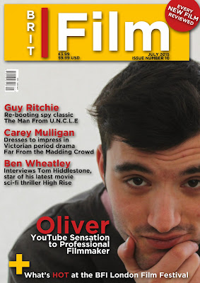
To create my poster and magazine front cover, I had to use Photoshop. This allowed me to put my ideas and plans into reality and create virtually anything I needed. I had to use a huge variety of tools, each with a different use and purpose. I used the text tool the most as well as using the different colour settings.
I inserted new text boxes and changed the font size to 200 for the title and 24 for the ratings. I also changed the colour of some of the key words such as "GRIPPING" and "EDGE OF YOUR SEAT" in blue for two reasons; police theme and to highlight and accentuate these positive reviews to the audience.
After adding the ratings, I inserted more text boxes for the tagline, the director and release dates, again changing the colour of some of the words to blue for the same reasons as above
Finally I added the production companies and the billing to complete my film poster.
I started with the subject on a plain coloured background after using the magnetic lasso tool to isolate him and place him on a different coloured background.
I added the cover lines which I had already thought of before and used a different colour and sized font for the title of them. I used a larger sized font for my dominant cover line.
I added the barcode, price, date and issue number and title. I used the vertical text box to type the "BRIT" part of the title in.
Finally I added a banner by inserting a red circle and rotating a text box so that it would be on a slant.
Saturday, 18 April 2015
Evaluation - How effective is the combination of the main product and ancillary text?
How effective is the combination of the main product and ancillary text?
As I was creating a marketing campaign for my film, it was essential for me to to use the same type of font and colours throughout my products as well as appropriate fonts and colours for their genre and product type. This also helps the audience instantly realise that each product is advertising the same film. By using the same fonts, it bombards the audience with that style making them more aware of the films and be more likely to view it.
For my film poster and teaser trailer, it was vital for me to use the same font and colour scheme so that the audience can identify both media products as belonging to the same film. Because of the importance placed upon the font and style, I spent plenty of time researching fonts that would be appropriate for a police themed thriller. After researching and conducting a questionnaire where I had people vote on which font suited the film and title the best, I chose to use Stamp from dafont.com. I used this font on all texts on the poster as well as on all texts on the teaser trailer.


By having the tagline "NOT EVERY CALL IS WANTED" engages and captures the audiences attention and curiosity. I chose this tagline as it is mysterious, gives little information away so that the audience can't immediately tell what the film will be about but just enough for them to vaguely guess. I also chose this tagline as it would catch their interest and make them more likely to see the film to find what the tagline was about.
I used the same font, Stamp, for my billing in my teaser trailer. By again using the same font, the audience connects and links the style and colour of font to my film as the same font is on the poster and teaser trailer. I noticed when I was analysing thriller teaser trailers that the billing is usually split into two separate shots so to add authenticity to my teaser trailer, my billing is divided into two sections. For my poster on the other hand, I used the standard billing font which is Steel Tongs and have it all in one paragraph which is what is done for posters.
Another convention that I found in all teaser trailers and posters was the use of web addresses, social media links and release dates. Again I used the same font and colour so that there is a pavlovian response to seeing the Stamp font and thinking about my film for the audience. It is important for my media products to have social media links as my audience is of the 15-30 age bracket who also use social media the most. It also gives the audience the opportunity to find out more information about the film if they are interested and a way for the film to 'keep in contact' and stay in the audiences mind by popping up on their Twitter or Facebook.
By also using vague release dates such as "SUMMER 2015" it tells the audience roughly when the film will be coming out. During my research into the differences between teaser trailers and theatrical trailers, I found that the teaser trailers usually say what season they are being release e.g. "This Spring" whilst theatrical trailers are more specific e.g. "April 12th". The vagueness also adds to the anticipation of the films release. I have also tied in the date of my magazine for when the film will be released. As my magazine will be advertising and talking about my film, it will also encourage people to view the film.
Because the magazine is a separate media product to the teaser trailer and poster, it will have it's own consistent style that the film is unable to influence. However, it is able to affect the dominant central image which helps sell the film. I have chosen to put the director as the central image on the magazine as I have made an independent magazine and in my research, I found that mainstream magazines have recognisable actors and characters nearly all the time whilst it is much more common for directors to be on the front cover of magazines.
Subscribe to:
Comments (Atom)


