The colour scheme is black and white but with a yellow wasp on the woman's face and in the title. The black and white can signify life and death whilst the wasp and yellow signify danger.
The skull on the wasp suggests that there will be deaths in the film
The actors names are on the poster as some of them such as Jodie Foster are linked to this genre
There is reference to the "terrifying" book
The fact that there is very little information given out in the poster adds to the mystery of the film
The colour scheme only consists of two colours, black and yellow, the black signifying death and unknown whilst the yellow normally stands for danger especially in nature
The lighting on Bruce Willis shows that there could be two sides of him as his face is lit from either side whilst the centre of his face is shadowed
There is silhouette of a boy in the middle of a six. The fact that it is just a silhouette of a boy shows that his identity is a mystery and that children are commonly found in thriller and horror films. The six can also signify The Devil or evil
The title and Bruce Willis's name are handwritten which can seem creepy and mysterious
The tagline has some religious meaning with the blessing which relates to the six
Very little information is given out about the film
I have decided to choose the thriller genre for my film. Now I will have to look at posters for films in the thriller genre and analyse them so that I will know what conventions to use and how to make my poster look as authentic as possible. I will be analysing The Sixth Sense, The Silence of the Lambs, Seven, Shutter Island and Memento. I will be analysing them in terms of their genre conventions.
After watching numerous teaser trailers, I have come up with a list and examples of the conventions commonly found in teaser trailer. This information will be useful for me as when I will need to make my own teaser trailer, I will know which conventions to put into it so that mine will look as authentic as possible.
Production Company logos
Images from the film
Title from the film
Release dates or a vague 'coming this summer' release date
Indication of genre
Website (usually at the end)
Voice over
Editing - transitions often include flashes, quick fades and dissolves
Cast, crew, director credits
Reference to other films
Images and names of stars
Reference to awards that cast/crew/film may have won or been nominated for
It starts with the production companies logos, an establishing shot of the city and then a shot of the family in a car playing a game. A motorbike then zooms past and smashes of the wing mirror then another motorcyclist gets smashed by large truck. Tense non diegetic music starts to play after a large explosion down the road. The tag lines are then split up with action shots of hundreds of zombies, military officials saying what international damage has taken place, soldiers shooting at zombies and now hundred of thousands of zombies scaling a cities walls. The tense non diegetic music is still playing even after the film title, website and release date are shown.
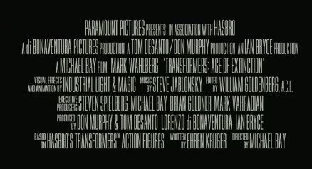
This teaser trailer opens with the production company logo and then an establishing shot of what appears to be an alien mothership and then rapid flashes of the protagonists and you see the antagonist shoot Optimus Prime. The tag lines are split up with plenty of action shots and explosions whilst epic yet tense non diegetic music is being played. There are nearly no impact sounds from the trailer which makes the non diegetic music more powerful. There are then two final shots of these mechanical dinosaurs which only give the viewer the slightest of ideas as of what will happen in the film. There is then the title of the film with the directors name and the website then there is the billing followed by the release date.
The teaser trailer opens with the production companies logo and then a point of view shot of a raindrop falling on Noah's face with a voice over from him. There is then very dramatic music and an action shot of men being wiped out by a huge wave. There is then a montage of Noah and his family building the ark before it cuts to another action shot of an army of men running a forest being swamped with water. There are then taglines split up with shots of all the animals going in by two into the ark and then the army of men united as one and then a quick flash of them being taken out by the water. There are then more action shots of the flood and men being killed whilst the non diegetic music peaks in volume and pitch. There is then the title of the film and release date with the website and social media links.
The teaser trailer opens with an establishing shot of the city and a voice over after two quick shots of the production companies. There is only a very brief overview of what is happening to the city before it cuts to a short montage of action which has extremely fast and quick paced editing in. The voice over comes back in and again says a brief description of the origins of the Teenage Mutant Ninja Turtles then there is another short action montage before a short snippet of a funny scene. The teaser trailer gives no information on the plot of the movie or the origins of these heroes.
The theatrical trailer has no voice overs in it and starts with a short clip of an action scene. The audience is instead thrusted right into the fight. There is a lot more information given out such as clearly defining who the main characters are and who the antagonists are. The audience can make a guess as to what the plot of the movie will be. This is due to much longer shots and scenes, less rapid editing and more than just the fighting being shown in the trailer.
The first noticeable difference between the two trailers is that the production companies names are rushed in the teaser trailer but in the theatrical one there is a shot between them. The music being played at the start of the theatrical trailer is the infamous whistling tune from Bridge On The River Kwai whilst the teaser has tense, action music increasing in pitch. The cutting and editing is a lot faster in the teaser trailer with plenty of explosions and guns. There is then a roll call of all the big stars in this film, each with a second or two clip of them looking generally bad ass. There is virtually no plot given or any sense of order, it is the the main cast and a few shots of the movie which is shown in the teaser trailer. There are also many visual slides hinting at what will happen in the film and the release date.
However, in the theatrical trailer there are many more shots and they are all a lot longer with slower, less rapid editing compared to the teaser trailer. The viewer can get some sense of the scene and the storyline. The shots are long enough for characters to talk and the audience can figure out who the antagonist is and who the protagonists are. There are enough short scenes so that the audience can gauge what the plot for the film will be. They see a lot of fighting and action scenes involving the protagonists both serious and humorous.
After analysing five different front covers from different publications, I have found many similarities and differences between based on what type of publication they are and the target audience. All the magazines have their masthead as the largest piece of writing so that it stands out the most and in the top quarter of the page.
There is always a dominant central image but depending on the type of publication, the central image could be a recognisable Hollywood star or a much less recognisable or even known director.
The majority of magazines have web addresses, dates, issue numbers, barcodes and prices regardless of what type of publication they are.
The cover lines vary between magazines as the mainstream Hollywood magazines have many colourful cover lines all over the page with many banners to catch the readers attention. The independent magazines have their cover lines in a neat and organised section of the page with far fewer banners.
The mainstream magazines have many other images which the others lack.
Filmmaker is an American independent that focuses on the making of the films, the financing and distribution of them. The masthead is not as large or 'in your face' as other mainstream magazines and it is in a quirky font. The dominant central image is of director Julie Delpy with a cover line next to her about her life and filmmaking. There are numerous other cover lines going down in a list. The dominant cover line is about new and uprising faces in independent films. The colour scheme is light and gentle.
Empire is a monthly British magazine that focuses on mainstream Hollywood films. The dominant central image is of Chris Evans as Captain America who is a recognisable A-list star from an extremely popular franchise. He is over the masthead which is the largest font the page. Above the masthead there are other images of Bond Girls with a cover line about it. The dominant cover line is about The Avengers which is in a bold font. There is also a banner advertising other of the same Empire magazines with different Avengers on such as Iron Man and Thor. At the bottom of the cover there are other images from The Hunger Games, Bourne and American Pie advertising them with a banner to catch the audiences attention. The colour scheme is bold and blue which is to match Captain America.